Cornerstone
Elements
Real Estate has always been local – and ERA is always in your corner.
Our elements reflect our local forward position in the market, highlighting the fabric of our global community on a local level. We are in your corner on every corner. Visually, corners are kind of our thing. However not every corner meets at an angle. To reflect the versatility of city streets we offer rounded corners within our map and our photo frames.
Corner Typographic Treatment
The corner element docked in the upper left is used to accent
typography to add a dynamic visual element that demands attention.
Our Layered Corners
Overlapping corners can be used in their own or in
groups to add depth and texture to ERA branded pieces
Variable City Map
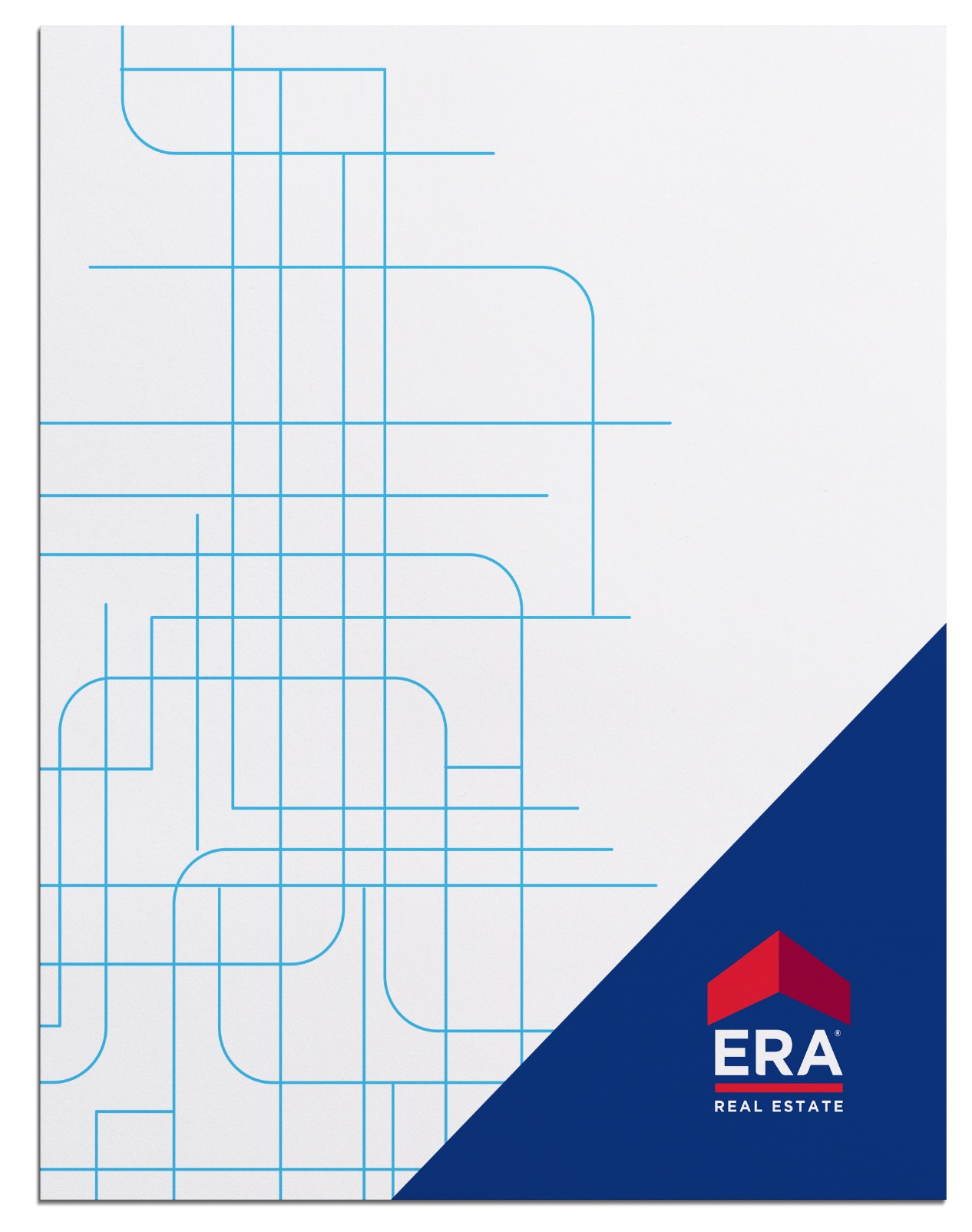
Our city map allows us to create dynamic compositions using converging lines to create both square and rounded corners. This can be used in any brand color or knockout white over the top of any brand color.
Rounding The Corner
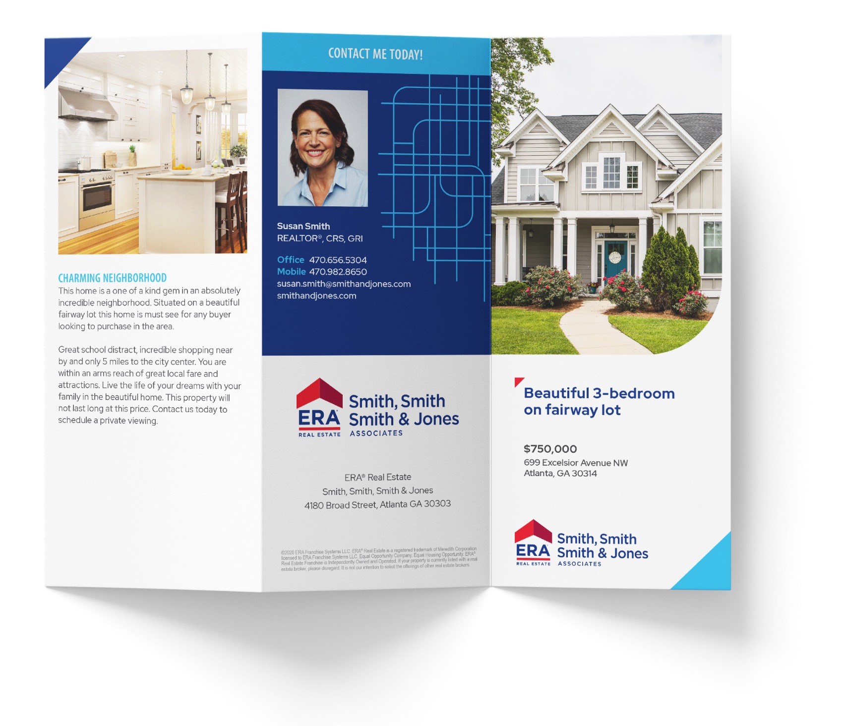
When integrating photography, rounding one corner gives us a unique look & feel – balancing a circular feature against the hard edges of the ERA brand elements. Our photography style is authentic, candid and compelling, utilizing soft & light photography to contrast our bold vibrant colorways. By creating depth with our shoot-through blur element, we also create that emotional connection and closeness.


Example creative
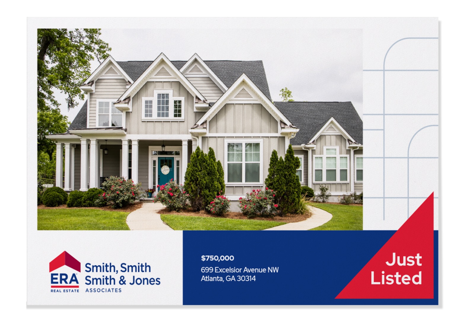
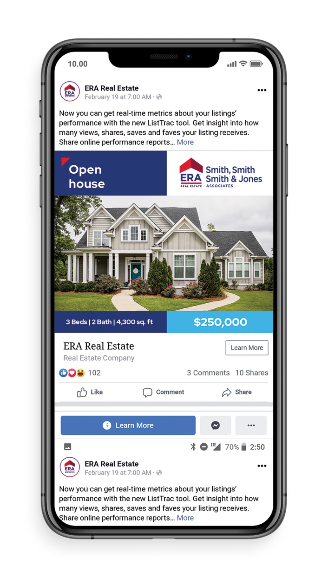
Our print and digital layouts showing all of our graphic elements in use and how they play against one another. Not all elements need to be used in compositions.
Example 1 - Showcasing the Corner Typographic Treatment,
Layered Corners & Rounded Corner Photos

Example 2 - Showcasing the Corner Typographic Treatment,
Layered Corners & Variable City Map

Example 3 - Showcasing the Corner Typographic Treatment,
Layered Corners, Rounded Photo Container & Variable City Map


contact ERA Marketing at Marketing@TeamERA.com.